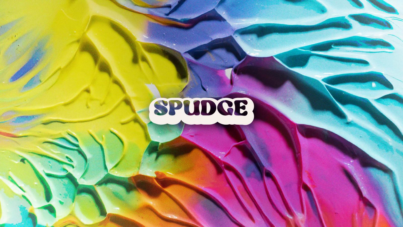
Spudge
Playful Polymer. Unfiltered Identity.
Project Details
Molding a brand for playful hands.
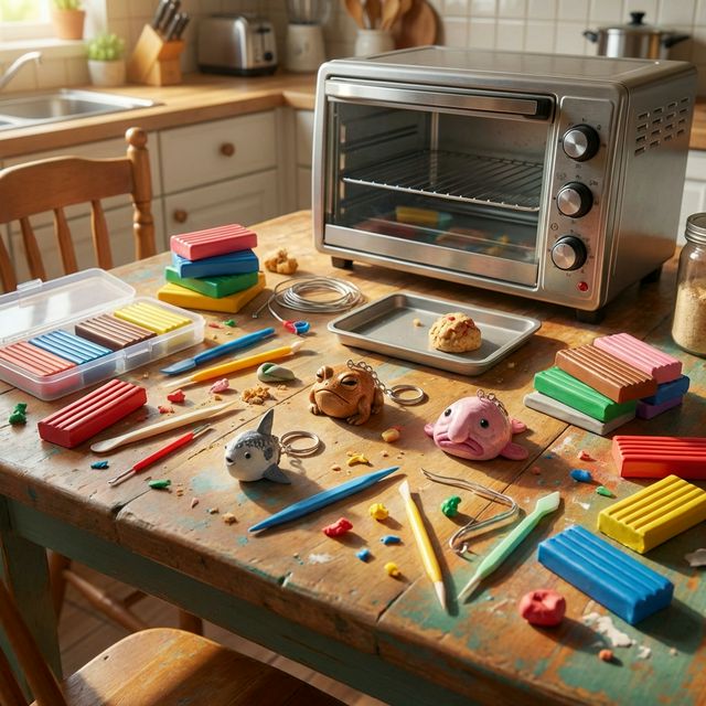
Spudge isn't about fine china; it's about the joy of hand-sculpted polymer clay. The brand sells small-batch keychains and charms that celebrate the fingerprint, the squish, and the do-it-yourself spirit.
We partnered with Spudge to build a visual identity that embraces the "kitchen-table" aesthetic—authentic, colorful, and happily imperfect.
From toaster oven to global shop.
The previous branding was too clean, too sterile. It looked like a medical supply company, not a vibrant small-batch accessory brand.
They needed a brand that felt approachable yet artistic, capable of standing out on a backpack or stopping a scroll on Instagram.
A mark you can squish.
We developed a visual identity that uses soft, fluid shapes and vibrant tones to mimic the malleability of fresh polymer clay.
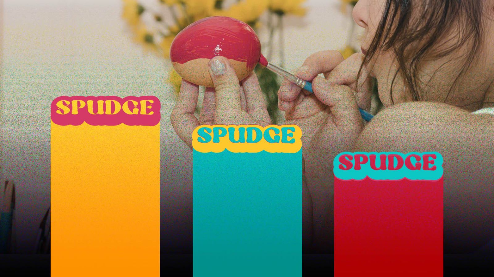
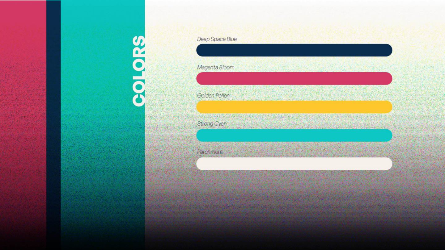
Color Palette
Neon Green, Hot Pink, and Electric Blue.
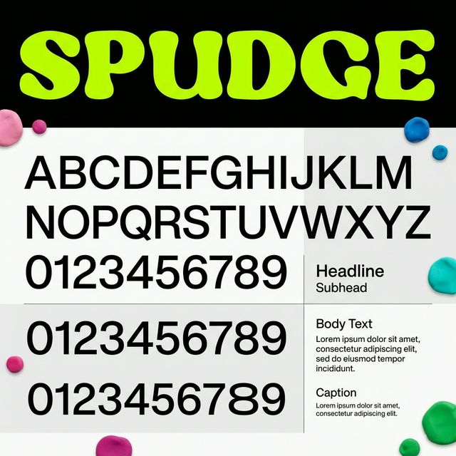
Typography
Hand-drawn feel mixed with clean editorial type.
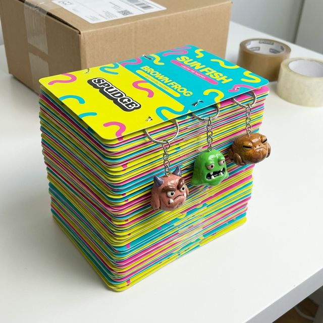
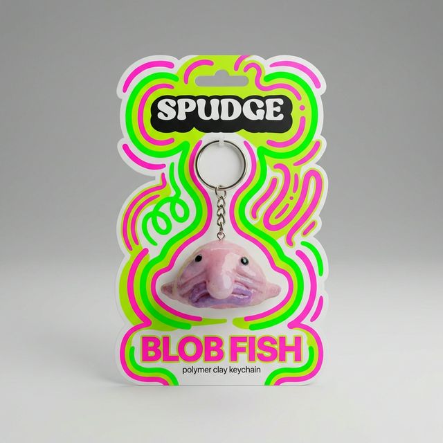
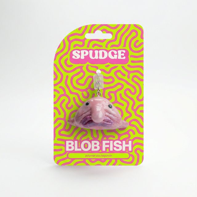
Collectible Backers.
Each keychain comes on a unique, die-cut backer card tailored to its personality. No plastic, just pure paper and polymer joy.
Peel. Stick. Obsess.
Die-cut vinyl stickers featuring Spudge's full character lineup. Weatherproof, scratch-resistant, and made to cover every surface you own.
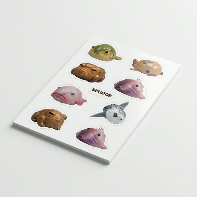
The Mega Sheet
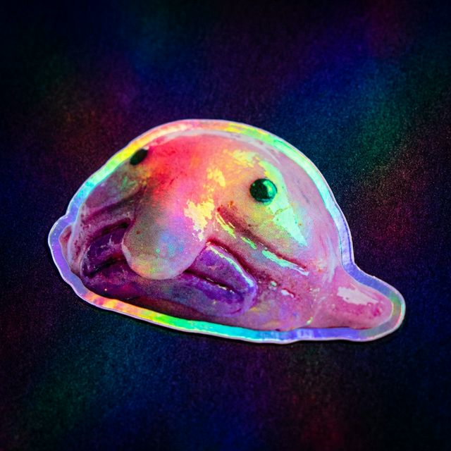
Holo Shine
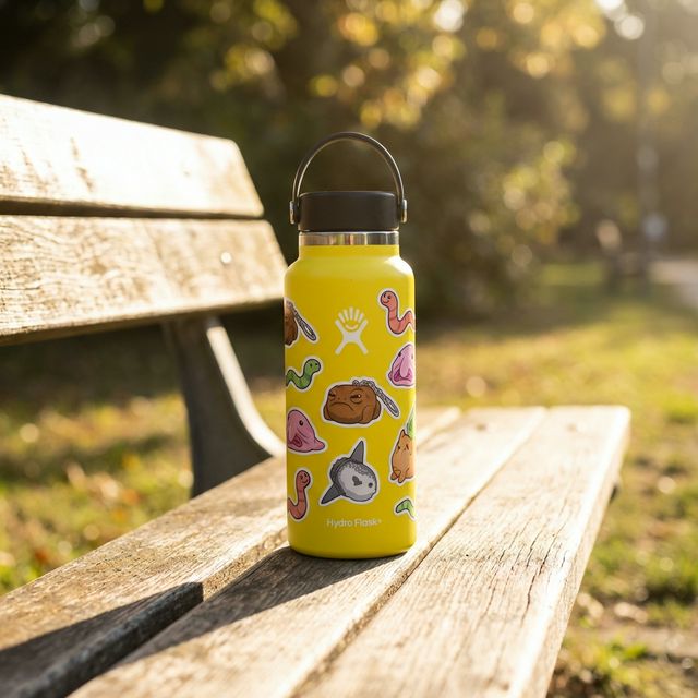
In The Wild
Baked to perfection.
Sell-out Rate
Merch Line Launched
Community Award
"Creatifind captured the chaotic, colorful joyful reality of my toaster-oven operations. We finally look like us."
See more work.
Every project is a story of clarity and collaboration. Explore how we've helped founder-led brands build their digital presence.