 Brand book · v1.0
The discipline behind the signal.
Foundation
The convictions underneath the expression
Creatifind turns judgment into a visible system. The brand should reveal how we think: careful before fast, specific before impressive, and human at every consequential decision.
What the identity must do
It must make rigor approachable without making it casual. It must hold attention without asking for it loudly. It must leave enough structure for people to trust the work and enough tension for them to remember who made it.
Two questions before anything ships
Is the decision legible? A viewer should understand what matters before noticing the technique. Is the expression earned? Every accent, image, and flourish must carry meaning. If it only decorates, remove it.
Character in one line
Measured, then vivid. Editorial restraint supplies the authority; a controlled flash of heat supplies the nerve.
Wordmark
One lockup, two inks
The wordmark is a supplied custom asset, not live type. Always use /images/logo-primary.svg; never reconstruct it from Archivo, recolor individual letters, alter its proportions, outline it, or rotate it. The approved asset runs in solid white on charcoal, photography, and heat surfaces.
Clear space equals the height of the f on all sides. Minimum size: 90px wide on screen. The ghost monogram CF (see chapter 05) is a texture device, not a logo, and never appears at full opacity.
Color
A closed palette · one accent · one counterweight
The palette is deliberately closed. Charcoal and cream are the grounds, signal orange is the single accent, and teal exists only as a small counterweight. Nothing else may be added.
The heat ramp
Signal, ember deep, and peach exist only as gradient stops. They are never flat fills, never text colors, never borders. A heat surface is always a gradient with grain on top.
Signal → ember deep → charcoal. The workhorse ramp for social and cover surfaces.
Signal → peach. The soft ramp, for warmer, lighter moments.
Proportion
| Role | Share of any layout | Rule |
|---|---|---|
| Charcoal / cream ground | 70–85% | One of the two grounds dominates every surface. |
| Heat ramp | 10–25% | Gradient washes, panels, cover fields. Always grained. |
| Accent | 1–5% | The f, links, chips, one emphasis per view. |
| Teal | 0–5% | Optional. Small marks only. Never near equal footing with orange. |
Typography
Archivo speaks · Inter explains · Newsreader reflects
Display type is Archivo Black-weight at large scale, sentence case, letter-spacing −0.03em, line-height ≤ 1. The spaced-caps subline (tracking +0.22em, regular weight) is the only large-scale caps treatment and always sits directly under a display line, never alone.
Name the decision. State the reason. Remove the sentence that merely announces confidence.
Scale
| Role | Face · weight | Size / tracking |
|---|---|---|
| Display | Archivo 900 | clamp(3rem–5.5rem) · −0.03em · sentence case |
| Heading | Archivo 800 | clamp(2rem–3.25rem) · −0.025em |
| Subline | Archivo 400 caps | 0.8125–1rem · +0.22em |
| Body | Inter 400 | 1rem · 1.65 line-height · max 65ch |
| Eyebrow | Inter 500 caps | 0.6875rem · +0.14em · stone |
| Longform | Newsreader 400 | 1.125–1.375rem · site only |
Numbers earn their place
Use numbers only when they communicate sequence or quantity. Ordered processes use plain-language labels such as Step 1. Quantities use a multiplication mark, such as 3× short-form cuts. Parallel principles and choices need no marker; compact attribute lists may use the orange rivet at 10px. Reserve leading-zero numbering for editorial navigation such as case-study chapters, figures, and plates.
Texture & devices
The recurring moves that make it ours
These devices create recognition without turning the identity into a template. Choose the few that clarify the idea, then let the rest stay quiet.
Grain
Film grain over every gradient and duotone. Nothing hot ships flat.
Ghost type
The headline word or CF monogram at 8–15% opacity, huge, clipped off-canvas.
Hairline rules
1px cream rules and thin outline circles supply editorial structure.
Chips
Small solid tabs, black or charcoal, accent caps label. One per surface.
Teal marks
Check icons and glow edges in teal, the counterweight to the heat.
Translucent panels
Semi-transparent bands carry copy over imagery so text never fights a photo.
Two surfaces, one system
The expression changes with the reading distance
A long page invites inspection. A social frame has to register at a glance. Both should feel made by the same mind, not copied from the same layout.
Space for evidence, sequence, and considered reading.
Cream ground, charcoal ink, quiet rules, and selective image scale. The serif may slow a passage down. Orange identifies the decisive point rather than filling the page.
One idea that survives speed and a smaller frame.
Heat may occupy more of the surface, but hierarchy stays strict. Use display type, one image or metaphor, and a single labelled takeaway. Never compress a web page into a post.
Imagery
Art-directed evidence, not visual filler
An image has one of three jobs: document something true, make an abstract decision tangible, or establish the material atmosphere around the work. If it does none of those, it is visual filler.
Creative direction
Build images from decisions, not decoration. Favor close crops, directional light, long soft shadows, and materials that remember contact: paper tooth, graphite, oxidized metal, frosted glass, blackened wood, and blind embossing. Orange marks an intervention, correction, or point of consequence.
Documentary images should retain the awkward detail that proves a real process happened. Concept images should obey believable camera and material logic. A screen, hand, or face appears only when the human action is the subject. Never use a person simply to make an idea feel important.
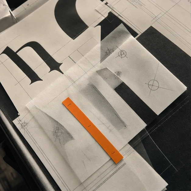
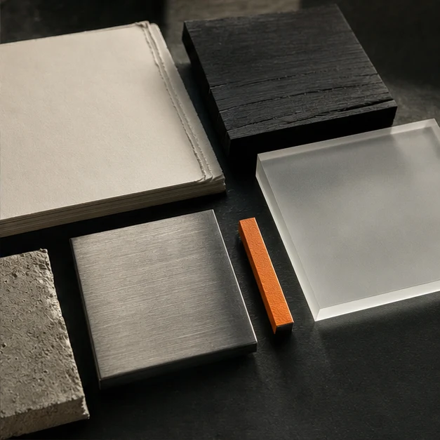
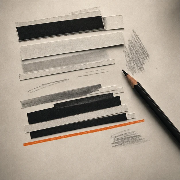
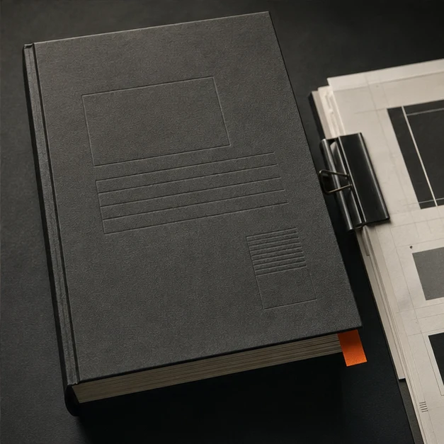
Labeling rule: client work and documentary photography may be presented as evidence. Generated or speculative imagery must be labeled as concept work whenever the surrounding context could imply it is a delivered client outcome.
Voice
Specific enough to be useful · calm enough to be trusted
Begin with what is true, then make it clear why it matters. Prefer a precise noun and an active verb to an adjective. Sentence case everywhere except eyebrows and sublines. No exclamation points, emoji, hype verbs, or borrowed urgency. Confidence comes from naming the decision and its consequence.
Sounds like us
- Start with the decision, not the decoration.
- One clear sentence is better than three impressive ones.
- Show the constraint. Then show what it enabled.
- Concept image. Directional only.
Does not
- We craft bold solutions that disrupt the status quo.
- A seamless fusion of strategy and creativity
- Best-in-class ideas for tomorrow's brands
- Any sentence that could belong to another studio
Tokens
The palette as shipped in src/styles/global.css
These names are canonical across web, decks, and social templates. If a value changes, it changes here and in global.css in the same commit.
/* Core */
--color-charcoal: #16130f;  /* ink / dark ground */
--color-cream: #f0e8d8;     /* light ground / text on dark */
--color-accent: #ff3c00;    /* signal — the one accent */

/* Heat ramp — gradient stops only */
--color-signal: #ec672c;
--color-ember-deep: #d44321;
--color-peach: #edb482;

/* Counter-accent — small marks only */
--color-teal: #37cfb6;

/* Functional warm neutrals */
--color-stone: #6e675c;
--color-line: #ddd7cb;

/* Compatibility aliases used by existing pages */
--color-paper: #f0e8d8;
--color-ink: #16130f;
--color-ember: #ff3c00;

/* Typeface roles and production fallbacks */
--font-display: 'Archivo Variable', 'Archivo', system-ui, sans-serif;
--font-sans: 'Inter Variable', 'Inter', system-ui, sans-serif;
--font-serif: 'Newsreader Variable', 'Newsreader', Georgia, serif;

/* Role-based type scale */
--text-display: clamp(3rem, 1.75rem + 3.25vw, 5.5rem);
--text-heading: clamp(2rem, 1.55rem + 1.6vw, 3.25rem);
--text-lede: clamp(1.0625rem, 1rem + 0.35vw, 1.375rem);
--text-body: 1rem;
--text-eyebrow: 0.6875rem;

--leading-display: 0.98;
--leading-heading: 1.02;
--leading-lede: 1.55;
--leading-body: 1.65;

--tracking-display: -0.03em;
--tracking-heading: -0.025em;
--tracking-eyebrow: 0.14em;
Canonical source: src/styles/global.css. This block mirrors the shipped values and should be updated in the same commit whenever the source tokens change.
Hard don'ts
Never
- Flat fills or text in signal, ember deep, or peach
- Teal and orange at equal visual weight
- A gradient without grain
- A second accent color, ever
Also never
- Generic stock photography or generated imagery presented as client evidence
- All-caps display headlines
- Carousel/parallax/hype patterns on the site
- Ghost type above 15% opacity